MAGICAL POWER OF TURQUOISE: HOW TO INTEGRATE BOLD COLORS INTO YOUR SKETCHES
- Julia Henze
- Aug 19, 2022
- 4 min read
Updated: Jul 10, 2023
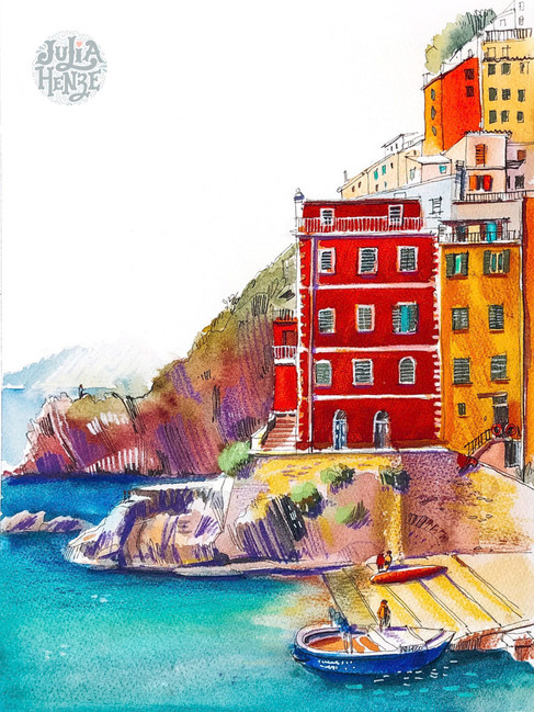
If there is one thing you can learn from me, it's this: do not be afraid to brighten things up! Do not be afraid to use bold colors. Turquoise is one of the (not so) secret ingredients of my colorful sketches. It makes my drawings vibrant and tranquil at the same time. In this post, I will talk about my love for turquoise and share some practical tips.

I have got a lot of practical information for you about which supplies to buy and how to mix your own colors, but let's start with love!
I love turquoise because it reminds me of the color of the sea in Italy. It never fails to brighten up my day, both while sketching and when I look through my sketchbook later.
I use turquoise for water in my sketches. In reality, water often has a greenish, brownish, or even greyish color. Compare the color of the water in the reference photo and the resulting sketch of a windmill.
I love turquoise for the richness and complexity of the color. As you will see below, cobalt blue, which is my favorite color, plays an important role in its composition. Turquoise also goes well with my other favorite color, orange.
Turquoise makes sketches bright and unusual. Very few artists use it in their urban sketches; that’s why my art stands out from the crowd. I always try to inspire my students to use bold colors in their sketches and not to be afraid to experiment. Join my class Urban Sketching with Gouache: Turquoise House by the Pool to play around with some turquoise! This class is also available on Skillshare and in Brave Brushes Studio, my membership for artists and urban sketchers.
If you want to add turquoise to your palette, you can buy pre-mixed paints or mix your own colors. In either case, get ready to fall in love!
Read on to learn what turquoise paints I have on my palette, how to mix your own colors with gouache and watercolors, and also which markers and pencils to buy.*
*Some links in this post are affiliate links, which means I get a small commission when you buy something (at no extra cost to you). This is a great way to support my free content.

WATERCOLORS
I use two shades of pre-mixed turquoise watercolors by Winsor & Newton:
Cobalt Turquoise Light Jackson's Art | Splendith
Cobalt Turquoise Jackson's Art | Splendith
These colors are pure joy, and I totally recommend investing in them, but I also believe it is essential to know how to mix your own turquoise. Here are the color combinations you can try to get various shades of turquoise.

Basically, you want to mix some shade of blue with green or yellow. Cobalt Blue is my favorite color ever, so that's what I experimented with. The pre-made turquoise paints contain the word 'cobalt' in their names, so I thought using cobalt blue as the foundation of my own mix might be a good idea. However, mixed with Cobalt Green Deep, it turned out too dark, and not as bright and vivid as I wanted. So I then tried it with Cadmium-Free Yellow Pale. It still looked too dark and a bit dull. So I repeated the same experiment with Manganese Blue Hue instead of Cobalt Blue. And now I am much happier with the color.
There is no perfect recipe for mixing turquoise with watercolors. The resulting color will depend on the shades you use and the quality of the pigment in your brand of watercolors.
GOUACHE
Gouache allows you more versatility and flexibility. There are more experiments you can do and more shades of turquoise you can get. What's the secret ingredient? The white paint! The use of white color is an important feature that distinguishes gouache from watercolors. My post Gouache Colors for Beginners explains how to mix colors from just the basic set of six.
Compare the samples below: no white in the top two samples, same colors + Zinc White in the bottom two.

Making such mixes is an excellent exercise. First, you learn to mix colors and discover the possibilities of your colors. Second, you learn how to paint straight rectangles or other shapes (you can choose to paint circles or squares, of course). Experiment with different brushes, too.
Here is a similar experiment with Primary Blue.

How does this compare with pre-mixed Winsor & Newton gouache? The pre-mixed colors are gorgeous! However, they don't give you enough range. So using your own darker mixes allows you to draw beautiful shadows.
Just like with watercolors, I use:
Cobalt Turquoise Light Amazon | Jackson's Art | Splendith
Cobalt Turquoise Splendith
MARKERS
After all these gouache experiments, it is hard to believe that you can achieve equally spectacular results with alcohol-based markers. However, you can have beautiful gradients with just three colors: Turquoise, Marine and Petrol Blue. When sketching with markers, you generally need a combination of three shades of a chosen color (a light, a medium, and a dark shade). See my Promarker Color Charts for the best color combinations. This should help you choose from the extensive range of colors available at art supplies stores (Jackson's Art | Splendith).
PENCILS
I do not usually make pencil sketches; I just use pencils for details. I mostly use Caran d'Ache Luminance pencils and Faber Castell pencils. Click here to read my blog post that lists all of the Luminance pencils that I use in my sketches.
Here is my turquoise collection:

I hope this post has inspired you to introduce turquoise into your sketches! Join my class Urban Sketching with Gouache: Turquoise House by the Pool to practice mixing colors and create a beautiful summer sketch. I use my favorite combination of gouache and colored pencils in this class, but some students have also done it with watercolors or markers.
The best way to learn from me is by joining Brave Brushes Studio. It is a club for urban sketchers and amateur artists which has a vast library of learning resources, regular live events and a friendly international community of artists who all share the same passion. Join now and start sketching!


